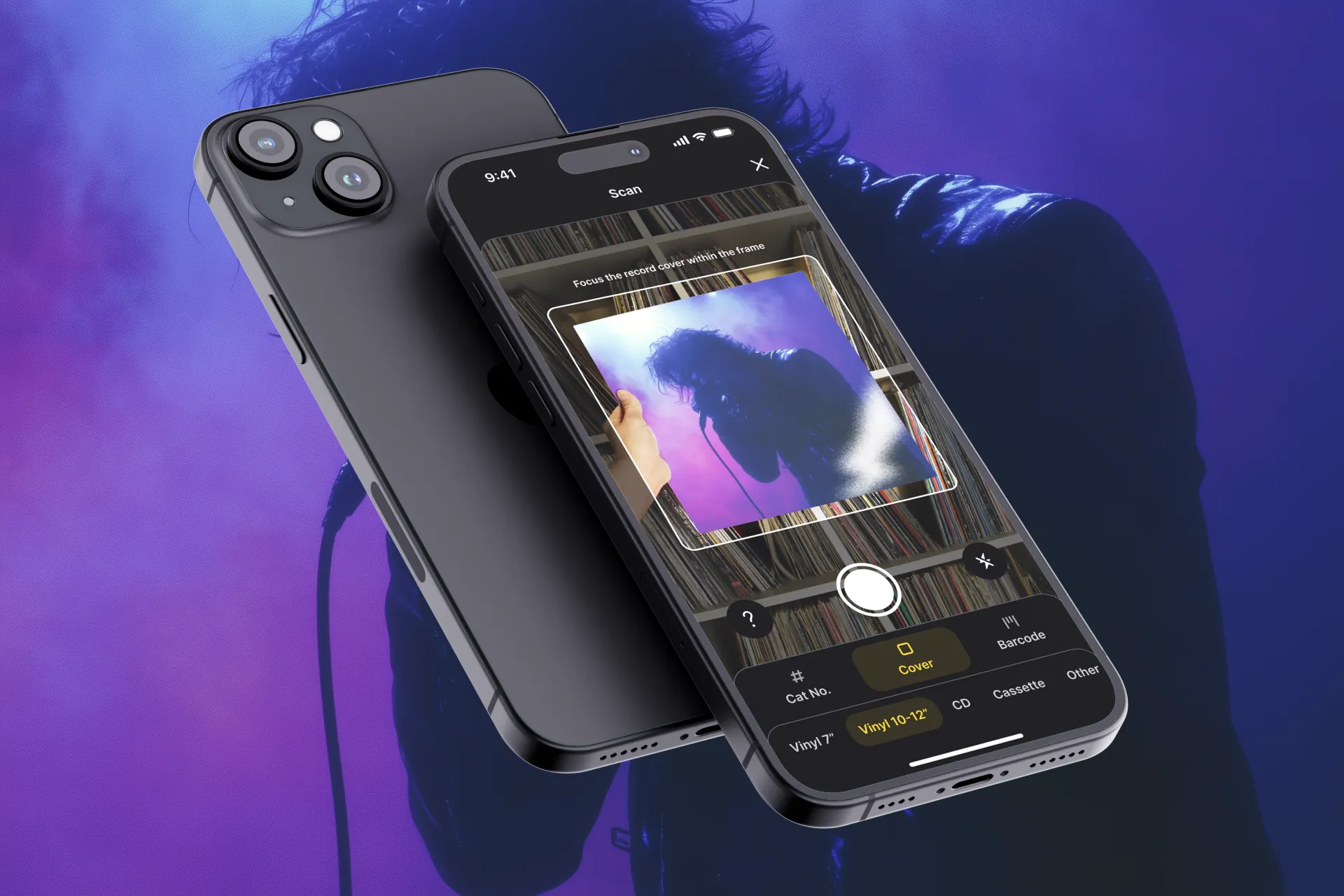
Humana (a placeholder name used for confidentiality) is a modular HR assistant platform designed to simplify the way employees interact with HR processes. The platform was created for a mid-sized European technology company and was later adapted for broader scalability across other organizations.
This project involved the end-to-end design process for building the initial MVP — starting from stakeholder alignment and research through to product definition, prototyping, and early validation. The project evolved from an internal HR tool into a customizable solution designed to support multiple organizations.
Due to a non-disclosure agreement, all names, visuals, and sensitive details in this case study have been anonymized.
To kick off the Humana project, we ran a structured stakeholder alignment workshop to surface critical pain points, success metrics, and project constraints across different departments. The session included participants from HR, IT, Legal, and employee-facing roles.
The workshop created early cross-functional alignment and a shared understanding of project success. It also informed prioritization of must-have features and MVP scope boundaries.


This research phase was conducted in close collaboration with a UX Researcher, with a focus on grounding the design direction in real user needs. Together, we defined specific research goals, crafted discussion guides, and selected a representative group of participants from across the organization.
Three key user groups were interviewed: employees (as end users of the chatbot and self-service portal), HR specialists (responsible for managing requests and enforcing policies), and new hires (to understand onboarding needs).

To meet emerging needs identified during research and early workshops, the product vision expanded beyond internal use. The team recognized that the challenges faced internally were not unique and similar friction points existed in other organizations. This led to a strategic decision: pivot Humana from a one-company tool to a flexible platform suitable for scaling across multiple clients.
This pivot required a shift in priorities, architecture, and design. Role-based access, customization options, and modular components were introduced to support varied organizational structures.

To support different user needs, we designed the app's information architecture (IA) around three core personas: Employee, HR Specialist, and New Hire. Each role has distinct goals, permissions, and daily tasks — and the IA had to reflect this clearly.
The IA was validated by mapping real tasks to each role and ensuring they could complete those tasks in under three taps or steps. This helped us avoid overlap (e.g., PTO requests via chat vs dashboard) and build a system that felt logical to each user type.
Before moving into interface design, we mapped out key task flows for each user role — Employees, HR Specialists, and New Hires. These flows helped us define which information and actions needed to be prioritized in each view. Our goal was to keep all user journeys focused, fast, and frictionless — particularly around time-off requests, document access, and onboarding tasks.
Once the flows were validated, we translated them into wireframes, including the home screen for both employees and HR specialists, and the full leave request form. We designed all wireframes essential for covering the complete MVP experience across roles. These early sketches made it easier to spot layout problems, role conflicts, and unnecessary complexity before visual design began.

The design system was built on top of the company’s existing component library, which provided a solid technical and visual foundation. However, we adapted and customized it extensively to meet the specific needs of the Humana product. This included introducing new patterns for conversational interactions, flexible layouts for role-based views, and guidelines for maintaining clarity across different HR contexts.
We anchored the visual style in Scandinavian minimalism: clean lines, muted colors, and functional typography. omponents were adjusted to support theming for future clients, and role-specific UI states were introduced to tailor the experience: employees saw simplified views, while HR users accessed denser, more data-rich interfaces. The result is a coherent, accessible system that feels native yet purpose-built.


To bring the experience to life and validate our design decisions, we created a high-fidelity prototype that reflected the flows for each role. The prototype included interactive screens for the dashboard, leave request form, chat interactions, and document browsing. This allowed us to simulate real usage scenarios and observe how users engaged with the product before development began.
We ran internal validation sessions with both employees and HR specialists from the software house. These sessions revealed areas where the flows could be tightened—for example, the importance of showing leave balance contextually during a request, or making input fields more visually distinct. We incorporated this feedback quickly, iterating on wireframes and interaction patterns to improve clarity, reduce ambiguity, and enhance the overall user experience.


To reduce confusion during time-off requests, we added contextual feedback directly beneath the date selector. It now shows the number of vacation days that will be used and the user’s remaining balance. Testers reported that this made them feel more confident in submitting their request without needing to calculate or check balances elsewhere.
The original “Message the Assistant” input field didn’t look interactive enough, and users were hesitant to tap it. We updated the design to align more closely with standard text input visuals, using clearer borders and spacing.


Based on user feedback, we added the option to pin key documents in the Docs tab. Users can now mark frequently accessed files, such as the Leave Policy, for quick access at the top of the list. This enhancement helps reduce repetitive searching and improves task efficiency — especially for HR specialists and new hires.
Once the prototype was validated and refined, we prepared a detailed and structured handoff for the development team. This included annotated Figma files with edge cases and interaction states. We also delivered a shared component library aligned with the design system, ensuring consistency and reducing guesswork during implementation. We worked closely with the developers to answer questions and prioritize critical details.
In parallel, we began planning beyond the MVP. Based on stakeholder input and leftover insights from the initial research, we outlined a roadmap of post-MVP opportunities, such as onboarding gamification, sentiment analysis, and global support. These ideas were shaped into modular enhancements, so they could be introduced without disrupting the core experience. This forward-looking approach ensured that the product could continue evolving after the initial launch—without needing to start from scratch.